IBM Workplace
A legacy product redesign showing vital team information at a glance
Dashboards | Data visualization | Legacy redesign
Overview
Goals
IBM Workplace is a legacy IBM Business Automation product that allows users to track tasks and manage workloads. Users can view a task’s priority and status.
I was in charge of the redesign for the manager experience.
Domains
Enterprise software
Productivity tools
Data visualization
Time frame
2 months
My role
UX designer working with a lead & PM
Dashboards for manager experience
For the business: Redesign a legacy tool to demonstrate IBM’s effectiveness in B2B products
For the user: Empower a manager to balance meeting team needs with organization goals
Legacy version vs. redesign. Visual design by Kylee Barnard.
Research
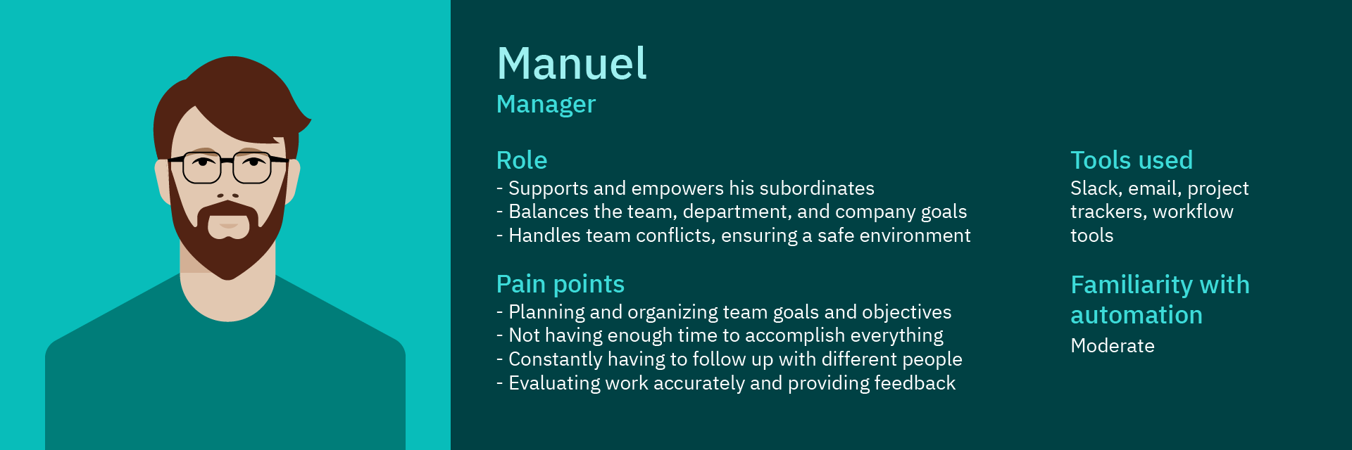
Meet Manuel.
Manuel is a team manager with a lot to do and not a lot of time to do it. He manages multiple product teams spread across several time zones and disciplines. How does he keep track of everything?
He uses IBM Workplace, which unfortunately is dated and difficult to use.
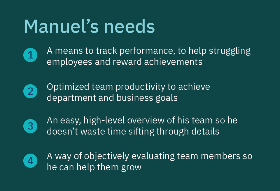
The old manager experience, pre-redesign.
In addition to user research, I also conducted competitive research on tools like Microsoft and Amazon Honeycode. I drafted out Manuel’s user journey as he moves through the product.
Design iteration
After creating a user journey map, I charted the information architecture and determined what information needed to be on what page.
What Manuel wants to see for each team and member:
The name of that team or member
Total tasks assigned to them
“On track” tasks
“At risk” tasks
“Overdue” tasks
With this information, I began experimenting with data visualization.
How does Manuel see more details for individual team members?
I experimented with progressive disclosure when a team member’s name was clicked.
Manuel can see that team member’s recent activity, tasks, and workflows.
Data visualization
How does Manuel get a sense of his teams’ health at a high level as quickly as possible?
Graphs provide fast, at-a-glance information to help Manuel see not just his current statuses and statuses over time.
I explored what sort of graphs would show Manuel what he’s looking for.
How does Manuel quickly find the details he’s looking for?
Providing different filtering mechanisms—such as by team or by task status—clears some of the clutter so Manuel can focus on what matters.
This dashboard was going to have it all: data visualization, status filters, delightful interfaces, and more! Then we ran into a classic designer problem:
For every ten great ideas I came up with, our team had the resources to build maybe two of them.
Complication: Breaking the team out of silos
The Workplace team wasn’t used to having designers integrated in the process, which meant we ended up working in silos.
This, combined with learning to work from home during the pandemic, led to communication snags and frequent misalignment.
One meeting, the developers presented a feature that wasn’t in our designs or the project requirements. An engineer had been tinkering with it because he thought it was a neat idea. At first I worried, because we had limited resources and I didn’t want the team building something without design input.
Then I realized that this exact sort of initiative was going to save the project.
The way we had been working wasn’t, well, working. I messaged the developer to change that.
Me: Hi Lionel! I really liked what you put together for the last sprint and was hoping we could collaborate earlier in the design process. Are you free sometime later this week?
Lionel: Hi Brighton, sure, I’m available after tomorrow. When do you want to chat?
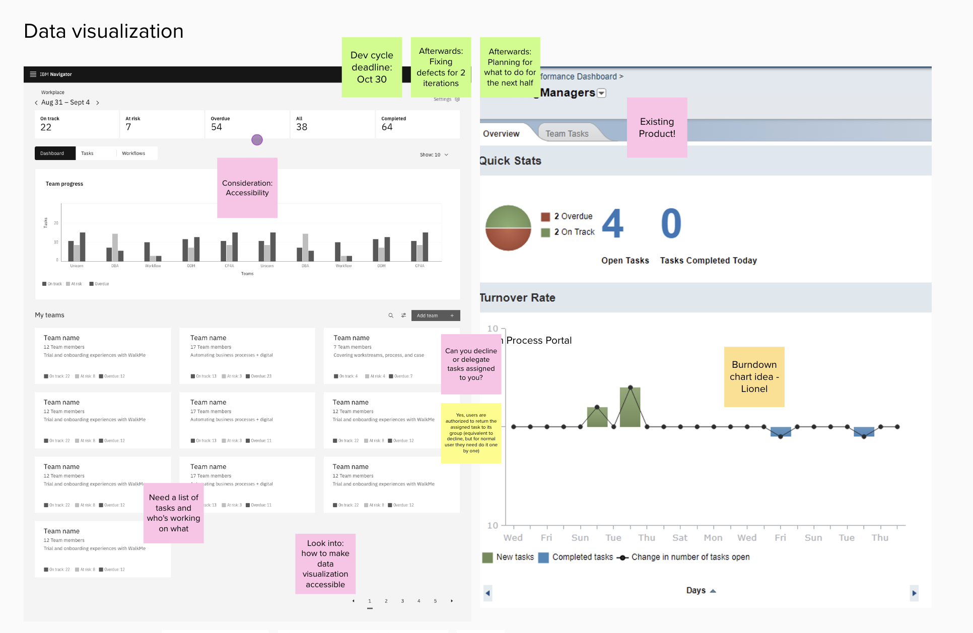
Not pictured: Me dropping one or two cat photos in the Mural whenever we hit a snag and needed a morale boost.
Lionel and I filled a Mural with dashboard examples, future ideas, and notes taken during meetings that could influence the design. Instead of presenting a single, finalized idea, I ran potential ideas by Lionel to ask which was the most feasible. I had a better idea of our constraints earlier on, while Lionel gained more of an investment in the design process.
Even more importantly, I had broken down a team silo and encouraged a non-designer to become an advocate for design.
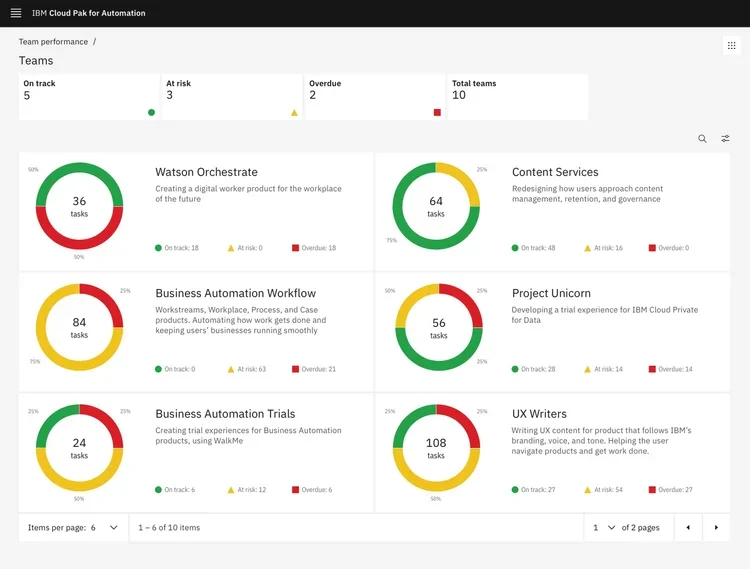
We changed the design to displayed the task status of the teams on cards, and Manuel could then click on the cards for details. Unfortunately, we weren’t able to build everything, but we did brainstorm more effectively than either of us could have done solo. The team performance dashboard was better for it.
Final design
The redesign, showing the user’s tasks and how they navigate to see team performance. Visual design by Kylee Barnard.
Due to technical constraints, we simplified the new redesign. Now, Manuel can see what his teams are up to and where he is needed. Even though much of data visualization work didn’t make it into the final product, I enjoyed developing my data viz skills.
Lessons learned
Every project and team teaches me something new about design. Here’s what I learned creating the team performance page:
For good collaboration results, tap into others’ passion. Not everyone on the team has a design background, but good product design comes from an underlying passion for problem solving. Instead of getting irritated with development adding new features without consulting design, I pulled them into the design process itself.
Don’t take more than two minutes on a low-fidelity concept. Freeing myself from getting hung up on details during the low-fi stage allowed me to rapidly prototype dozens of ideas in only a few hours.
Teammates make excellent research resources. Due to time and team constraints, I did not get the user research I would have liked on this project. I adapted—reading articles on effective management, asking my own manager, and critique from the team helped me finesse my ideas.
Next project
AI legal compliance
Using generative AI to save legal firms hours (and millions of dollars) in drafting their time entries
Intapp Time | 225,000 users | $150 billion/yr in billing