IBM product trials
How a six-week redesign increased user engagement by 31%
Overview
Goals
Businesses want to automate processes and streamline workflows. To give them a taste of what’s possible, IBM offers 15-day free trials of Cloud Business Automation. Users can explore software capabilities, build apps, and monitor usage.
The hiccup: Our trial experience needed a redesign.
Domain:
Trial + onboarding experiences
First time user guidance
Time frame:
6 weeks
My role:
Sole designer
UX, visual, and content design
For our business: Demonstrate the value of our capabilities to prospective buyers
For the user: Understand the product and what IBM offers
Before and After my redesign. Would you use a product with a trial experience that dated?
Background
The stock images on the previous trial experience were friendly! But the experience was not.
The existing experience required users to follow a complex set of steps listed on a webpage as they navigated multiple demos. Users got lost and often dropped the trial—and our product.
I was the sole designer, covering UX and visual design, to make the trial experience attractive, informative, and compelling. My successful redesign improved clickthrough rates as high as 22%.
And we pulled it off in only six weeks.
Research
No matter the problem I’m answering or the timeframe I am working in, I always start off the design process with two questions:
1. Who is this for?
2. What’s already been done?
Our target persona was Sam, the buyer. Sam’s main need is to find technology that enhances her team’s strengths and does not inhibit their daily work and success. I read and listened to previous interviews our research team had conducted with multiple “Sam”s to understand her pain points and what would encompass her ideal trial experience.
Next, I went on a trial spree. I signed up for different free trials across multiple industries, noting what made them successful or what turned me off as a potential buyer. I determined the 3 things that make a successful trial experience:
The quality of information
The flow of exploration
An elusive “wow” factor that makes the user see their existing work in a new light
Design
I worked with product management and content design to determine what features to highlight. Business Automation’s best selling point is how easy it is to create and deploy apps, so we developed a flow walking the user through building an app of their own.
We created the tutorials using WalkMe, which places tooltips and modals on top of existing UI.
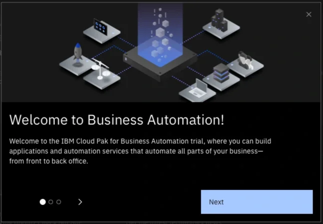
Click-through carousel introducing the user to Cloud Business Automation
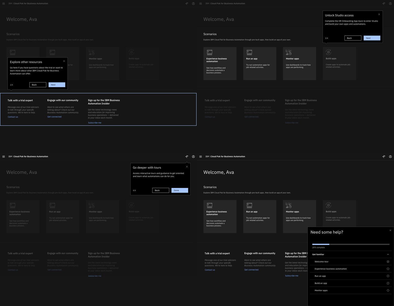
Tours using tool tips to walk a user through the product
I designed five tours in total:
An overview of the UI
Two walkthroughs of pre-made apps
A walkthrough where the user built their own version of a previous app
An overview of a dashboard that allows the user to monitor their apps’ usage and errors.
All but the first were task tours, meaning the user was guided step by step as they learned to use the software. We used tool tips that were connected directly to UI components.
User testing
Due to the accelerated timeline, we did one round of user testing. Highlights:
“I like that it has an animation of what to do. Sometimes you get lost if [the tour] doesn’t point out a specific way to do something.”
“I gave it a 5 [out of 5] because it was pretty informative… It showed how to make an app and was easy to click through.”
“Maybe it should have more examples for different industries. I didn’t really understand the example here.”
Overall, the response was positive, in particular how the task tours guided the user through the entire experience—one point of feedback was to include pagination in the tooltips so the user knows how much of the tour they have left. Once the trial experience itself was launched, we saw an improvement of 16% for conversion rates in only three months!
An additional complication
With two weeks to go, the team asked me, “So when can you get us the illustrations?”
I had thought we would use art from IBM’s library, and none of the visual designers on my wider team had the bandwith to knock out a whole series. So, with ten business days to teach myself a new isometric art style, I contacted visual designer teammates for resources and dove in.
Hours on Adobe Illustrator paid off. The team loved the illustrations and the product went live.
Final design
Introductory carousel
Featuring my digital illustrations and UX content, the carousel introduces users to IBM Cloud Business Automation and invites them to take a tour.
Product tour
These product walkthroughs bring the user through the UI.
Users can select a tour that matches what they want to see: building an app, running an app, or accessing their dashboard.
Lessons learned
Every project and team teaches me something new about design. Here’s what I learned from creating the Business Automation trial experiences:
If you’re in a time crunch, turn to what’s already there. The short turnaround and that I was still working on my primary team in addition to this project meant that I didn’t have the time to conduct the in-depth research I’d have liked. Instead, I reviewed previous research conducted on our target persona and spent a couple weeks being ruthless with my time management. I also used as many visuals and components from our existing library as I could.
Keep a list of everyone’s time zones. Our team spanned five time zones in two continents. I would sometimes have a question for the engineering team at 3 PM Central Time, which is 10 PM in Germany.
Adobe Illustrator does not care that you’re in a rush. I will forever be thankful to the visual designers for answering my panicked Slack messages in the middle of the afternoon. Did I know what color profiles were before this project? I do now.
Next project
IBM Workplace
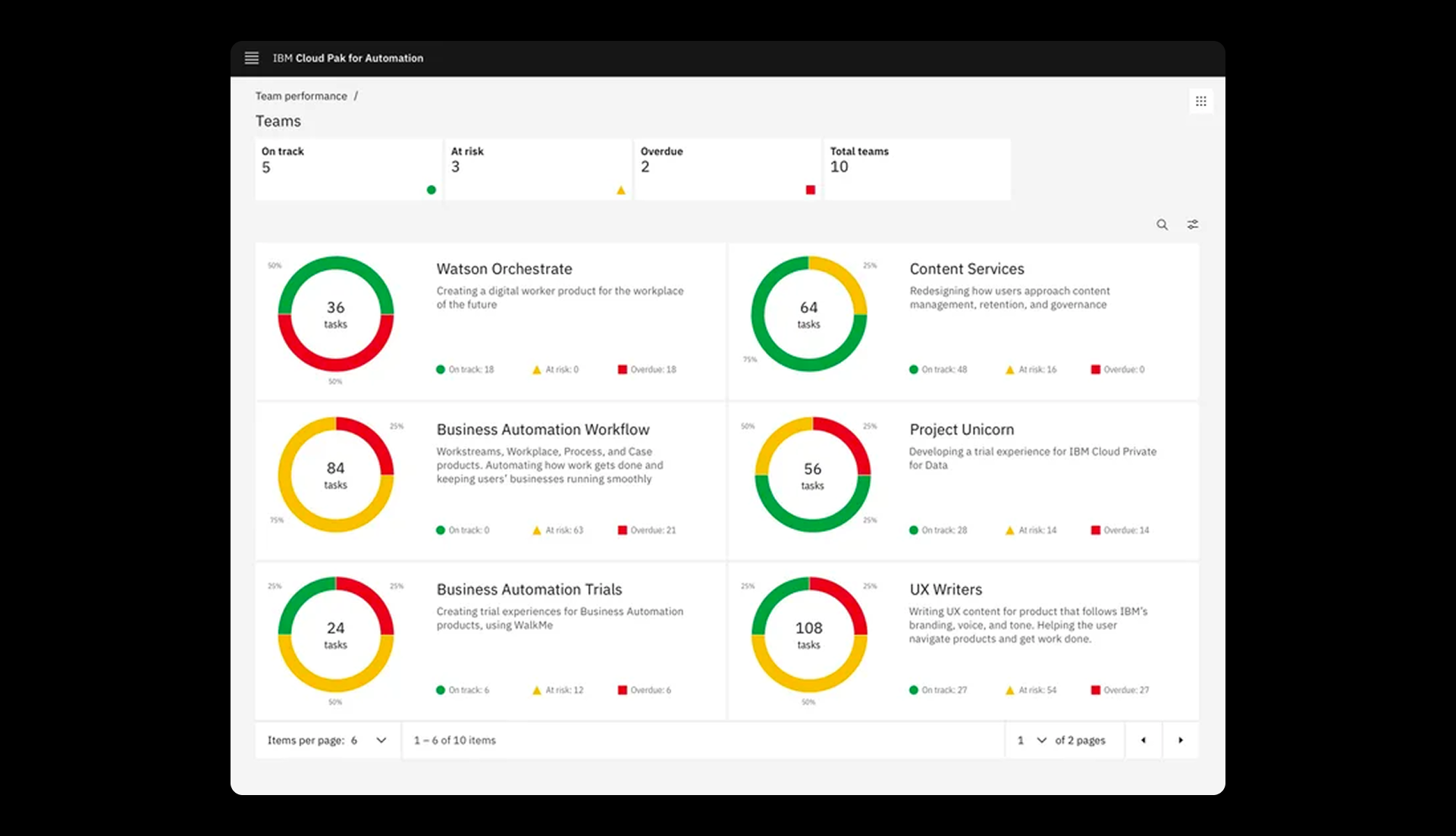
A legacy product redesign showing vital team information at a glance
IBM | Dashboard design | Data visualization